Brand Reference
Ohio Pride PAC Brand System
The v2.0 mark, color, voice, and digital specs the team uses to keep Ohio Pride PAC sounding and looking like itself — calm, institutional, and built for the long fight ahead.
Section 01
Why we rebuilt the mark
The v1 logo was generated quickly to get us launched. It read as a startup. The v2.0 wordmark fixes that. It signals stability, professionalism, and seriousness — the visual language donors expect when a PAC asks them to back real political work.
Calm, institutional, "big-tent." We don't need rainbow on every surface to prove we're a Pride org. Our work will showcase that.
What changed
Navy is now #152233, a measured shift from generic navy that reads as authoritative without looking corporate. Light blue is now #70D6EC and is reserved for the "PRIDE" half of the wordmark and on-dark accent text. The Progress Pride rainbow stays in the system — but as a deliberate accent (thin stripes, the donate button, on-brand celebration moments), never as default chrome.
Section 02
The wordmark
The wordmark is constructed as two stacked elements: OHIO PRIDE set in Montserrat with OHIO in the brand foreground color and PRIDE in Light Blue, followed by a hairline divider centered on the word PAC. The hierarchy is deliberate — PRIDE (movement) sits above PAC (machinery).
Primary — on navy (default for digital)
Light backgrounds
Banner lockup
For website headers, email banners, and event collateral, use the wide banner lockup with the tagline and Progress Pride underline. Built at a 9:4 aspect ratio.

Clear space & minimum size
Maintain clear space equal to the height of the "O" in OHIO on all sides of the wordmark. Minimum width: 140px on screen, 1.25 inches in print. Below this, switch to the favicon mark.
Endorsement badge
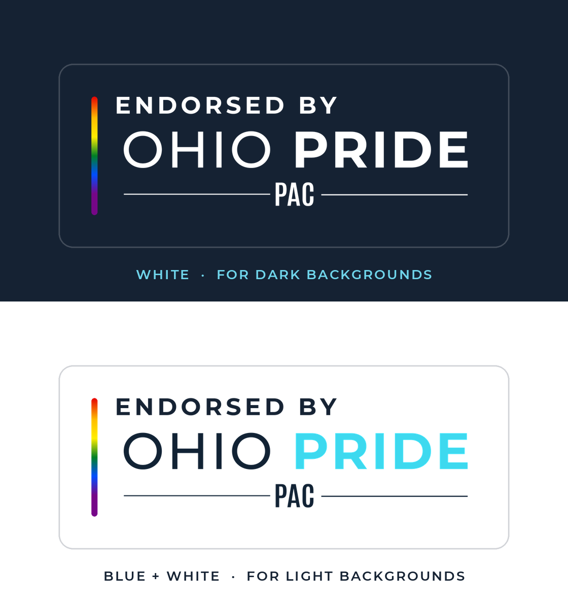
The "Endorsed by Ohio Pride PAC" badge is a fixed lockup for candidates, campaigns, and partners to display when Ohio Pride PAC has endorsed them. Use it only with an active, on-record endorsement. Two variants cover every surface: pick by background, and never rebuild or recolor it.
The badge certifies a real endorsement — it is not a general-purpose logo. Don't hand it to candidates we haven't endorsed, and don't stretch, recolor, or add a drop shadow. On busy photos, use the white variant with clear space around it.
Section 03
Asset downloads
Direct links to canonical assets. SVG is the default; PNG is offered for tools that cannot consume vectors. Source .ai files live with the brand team.
Vector (SVG)
Transparent PNG
Square lockup (avatar / profile)
Endorsement badge
Section 04
Color system
Three brand colors, three roles. Navy is the foundation. Light Blue is the accent. White is the breath between them.
Core brand
Navy Primary
#152233 --brand-navyLight Blue
#70D6EC --brand-light-bluePure White
#FFFFFF --brand-whiteNavy Footer
#0D1726 --brand-navy-footerProgress Pride palette (accent only)
Red
#E40303Orange
#FFBC00Yellow
#FFED00Green
#008026Blue
#004DFFViolet
#750787Black
#000000Brown
#613915Pink
#FFAFC8Signature gradient
linear-gradient(135deg, …) · token --brand-pride-gradient
Horizontal sweep variant
linear-gradient(90deg, …) · token --brand-pride-gradient-h
The Progress Pride gradient is for thin dividers, donate-button fills, and accent stripes — used deliberately, never decoratively. The raw Pride chips fail WCAG AA on Navy; for accent text on dark, use --brand-text-accent, --brand-text-danger, --brand-text-success, --brand-text-warning.
Section 05
Typography
Montserrat handles headlines, UI, and the wordmark. Roboto Slab carries body copy and long-form reading.
A clear, steady
voice for Ohio.
Endorse. Mobilize. Fight for Ohio.
Section title · Montserrat Bold 700 · 22–30pxPro-Equality · Nonpartisan · Ohio-Focused
Eyebrow / label · Montserrat Bold 700 · 10–11px uppercase · 2–3px trackingOhio Pride PAC is a state-level political action committee registered with the Ohio Secretary of State, dedicated to building political power for LGBTQ+ equality across every corner of Ohio. We endorse pro-equality candidates, mobilize voters, and fight anti-LGBTQ+ legislation in the Ohio Statehouse.
Body copy · Roboto Slab Regular 400 · 15–16px · line-height 1.75Section 06
Voice & tone
Confident, not loud. Action-oriented. Complementary, not competitive. Nonpartisan, pro-equality. Institutional in feel, neighborhood in voice.
The clear, steady voice of an Ohioan who's done waiting — informed, organized, and ready to fight for neighbors at the ballot box.
Word choice
Use
- Pro-equality candidates
- LGBTQ+ Ohioans and their families
- Ally / Pro-equality leader
- Ohio Statehouse / Ohio General Assembly
- "Build durable political power"
Avoid
- Partisan labels in voice copy unless legally required
- "Activist" framing — use leader or organizer
- Passive constructions
- Naming peer advocacy orgs in comparison copy
- Performative rainbow flourishes in headline copy
Section 07
Messaging pillars
Section 08
Digital specs
Favicon system
A simplified OH monogram on Navy Primary, sized for every browser surface. Shipped under /assets/favicon/.
 16×16
16×16
 32×32
32×32
 96×96
96×96
 180×180
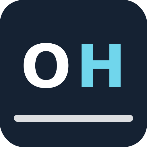 512×512
Open Graph image
Default share image lives at /assets/social/og-image.png at 1200×630 — primary wordmark on Navy with the Progress Pride underline tagline.
Theme color
Mobile browser chrome: <meta name="theme-color" content="#152233">.
Tokens, helpers, and the consistency check
Every page consumes the canonical tokens at /css/brand-tokens.css and the shared chrome injected by /js/site-template.js. The npm run check:brand script walks every public HTML page in the repo and flags drift before a PR can land. See docs/brand-system.md for wiring details.
Section 09
What not to do
Recolor PRIDE to anything other than Light Blue, White, or Navy.
Drop a rainbow gradient into the wordmark. The mark is monochrome by design.
Stretch, condense, or rotate the lockup. Scale uniformly.
Place the navy-on-white wordmark on a busy photo. Use the mono white wordmark instead.
Use the v1 wordmark from before May 2026. It's retired.
Mix the Pride orange #FFBC00 — it's been retired in favor of #FFBC00.
Brand Guide v2.0 · May 2026 · Last reviewed by the Ohio Pride PAC team.
← Back to About